Stop Guessing
Get real edge on
2300+ Stocks Daily
One Clean Dashboard. Fundamentals + Technicals + Relative Strength + Peer Comparisons. Color-coded Top 1%, 5%, 10%, 25% ranks. One Click Refresh.
Used daily by active traders who want real peer context.
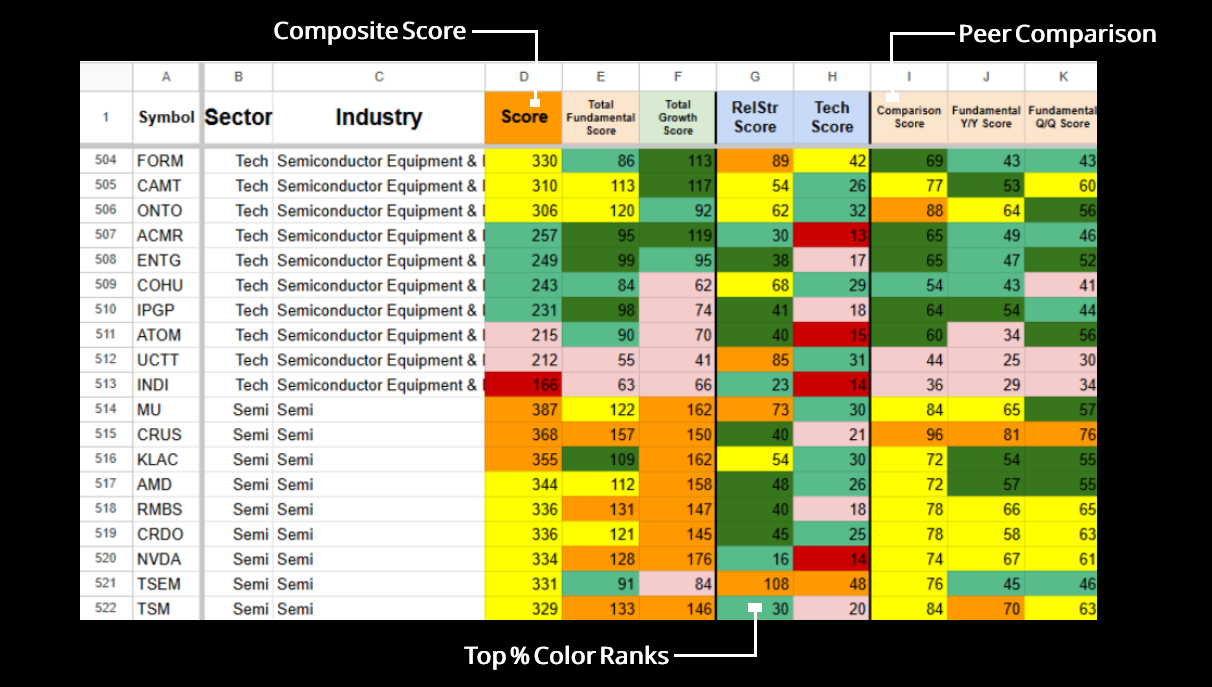
Your Daily Command Center: Watchlist Summary
Stop piecing together data from multiple tools — one sortable dashboard has it all.
Instantly see which stocks have real strength behind the move (and which don’t).
Sort and filter however you want. One dashboard. No scattered tabs.
Transparent, rules-based scoring — not opinions or guesses.
See exactly how every score is calculated
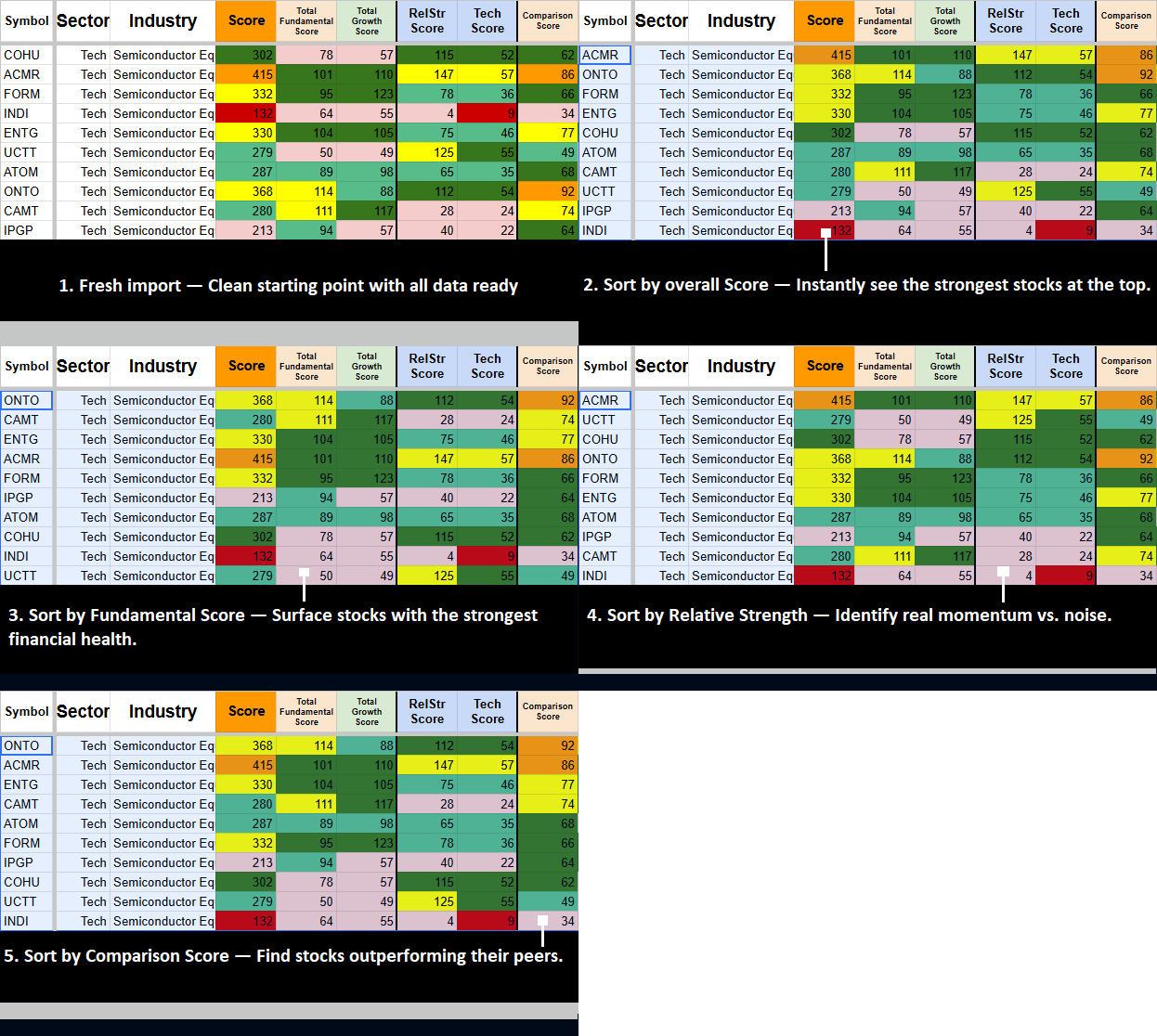
How the Watchlist Summary Gives You a Real Edge
Most traders waste time jumping between tools and second-guessing whether a move has real strength behind it.
-
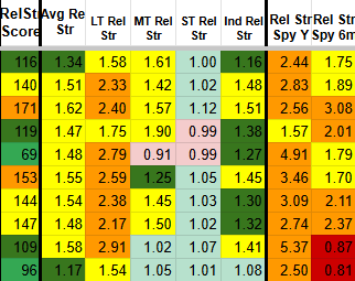
Watchlist Summary shows you the full picture. Composite score + how it compares to its peers in one view.
-
Integrated fundamentals, technicals, and relative strength help you quickly tell real strength from noise.
-
Everything you need lives in one clean, sortable dashboard.
-
Built-in sector and peer comparisons show you where the real strength is across 2,300+ stocks.
-
Clear color-coded rankings (Top 1%, 5%, 10%, 25%) and transparent scoring help you act with confidence.
This is the Foundation
The rest of the system builds on top of it — layer on specialized tools for even more power when you’re ready.
Build Your Edge
MAYBE REDO THIS SECTION WITH A SS DEFAULT PAGE/SECTION THAT LOOKS PRETTY. PRODUCTS DEEFAULT CARDS
Start with the Watchlist Summary. Then layer on the focused add-on tools that match your trading style. Each tool works independently or together, stays fast, and updates with one click.
Industry Strength Rankings
See which industries are gaining real strength and participation across the market.
Market Sentiment
Get a daily, high-level view of market breadth, leadership, and overall participation in one clean view.
Performance & Relative Strength Pack
Track how your stocks are performing relative to the market and their peers in real time.
Industry Performance Rankings
Quickly identify the strongest and weakest performing industries with clear relative rankings.
Stock Performance Query
See how any stock has historically performed in nearly identical setups before you take the trade.
Stock Deep Dive
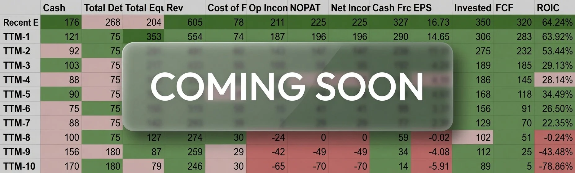
Coming Soon — Deep, detailed fundamental and technical analysis on individual stocks.
Proven Edge for Traders
Analyzes 2,300+ stocks daily with transparent, rules-based scoring
Used by active traders for peer-relative decisions and faster insights
One-click refresh keeps everything current — technicals update moment-to-moment, fundamentals update with new earnings
Instant setup with your own personal template. No long-term contracts. Cancel anytime.
Ready to Stop Guessing and Start Trading With Real Edge?
You now have everything in one system:
Watchlist Summary — Your daily command center with 2,300+ stocks, composite scoring, peer comparisons, and one-click refresh.
Focused Add-on Tools — Industry rankings, Market Sentiment, and Watchlist Performance tools that layer on top when you need them.
Advanced Research — Stock Performance Query and (coming soon) Stock Deep Dive for deeper analysis.
Mix and match however you want. Every tool works together with the same fast, sortable experience.
If you’ve ever been looking for one-symbol entry and one-click analysis — this is it.
Industry Strength Rankings
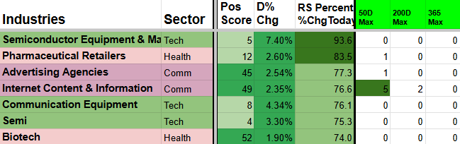
Industry Strength Rankings gives you a clear daily view of every major industry’s true momentum and breadth. It combines participation (how many stocks are moving together), short-term and long-term momentum, and multi-timeframe trend signals into easy-to-read Positive vs Negative scores and breakout/breakdown alerts.
Instantly see which industries are gaining real power and which ones are weakening so you can rotate into the strongest groups.
Daily rankings of industries by Positive Strength Score (bullish breadth + momentum) versus Negative Score (bearish pressure)
Highlights industries hitting new highs or breaking above short-term averages across 5D, 20D, 50D, 200D, and 365D timeframes
Fully sortable and color-coded for instant clarity
One-click refresh keeps the data live every day
How the Scoring Works
The tool calculates industry averages from the Watchlist Summary and Industry log sheets. It awards positive points when an industry beats its 5-day or 20-day average, and negative points when it falls below. Extra points are given for hitting new highs or lows on the 20D, 50D, and 365D timeframes. It also incorporates relative strength and Finviz breadth data.
Industry Performance Rankings
A different view of looking at Industry Strength. Scores based on Watchlist Summary Performance and Relative strength.
See Industry Scores from a simpler, yet holistic performance point of view.
Daily rankings of industries by overall performance and momentum
Shows strength across multiple timeframes with clear winners and underperformers
Incorporates relative strength against the broader market and sector peers
Fully sortable and color-coded for instant clarity
One-click refresh keeps the data live every day
Use it with the Watchlist Summary and Industry Strength Rankings to quickly identify the best sectors for new trades and avoid the weakest ones.
Yes its a strong Industry, but for how long? Is it a new breakout? Is it a false breakout? Does breadth support it?
ISR will show you the deeper answers, rather than looking at a single percentage point.
Color Coding
Light green — Strength improved from yesterday
Dark green (5D/20D)— At or near maximum strength (max points or just 1 off)
Dark green (50D/200D/365D) — 4+ new highs or 33%+ of points hitting new longer-term highs
Orange (50D/200D/365D) — Half the possible points are at all-time highs or lows (extreme move)
One-click refresh. Fully sortable. Use it with the Watchlist Summary to focus on the strongest industries.
Metrics that earn points
1D, 20D, Weekly %, Monthly %, Quarterly %, 6M %, Yearly %, 52Wk High, Today Up %, Above 50%, 20D High, 20% Up on Monthly Avg, Avg Rel Str, LT/MT/ST Rel Str, plus Finviz breadth and participation.
Instantly see which industries are leading or lagging the market across multiple timeframes.
How the Scoring Works
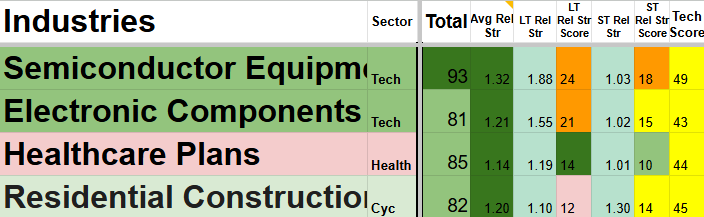
The tool pulls live data from the Watchlist Summary and calculates industry-level performance using percentage changes, relative strength metrics, and ratio comparisons. Higher Total Scores indicate stronger industries; lower scores highlight weaker ones.
Industry Performance Rankings gives you a clear daily view of which industries are truly leading or lagging the market. It combines raw percentage gains, relative strength comparisons, and key ratio performance into one easy-to-read Total Score for every major industry.
Different sorting styles allow for difference strength gaugues.
Sort by ST Performance score to see the industries where the stocks had the greatest ST % Gains.
Sort by ST Rel Str score to see the industires where the stocks had the greatest outperformance relative to their sectors / peers / SPYder ETFs.
Sort by LT Scores to see the industries that are performing/holding the best during market drawkdowns.
Combinations are limitless
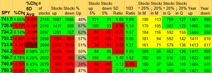
It tracks market internals and includes built-in breadth charts so you can visually spot highs and lows in market participation
Market Sentiment Dashboard
Market Sentiment Dashboard gives you a clear daily view of overall market psychology, breadth extremes, and internal health.
Spot when the market is approaching historical tops and bottoms on multiple different breadth data points.
Shows running daily performance % changes for FANGMANT, Mega Caps, Big Tech, SPYders, and all major sectors. (Averages for every group except FANGMANT are based on the 20 largest stocks in that category.)
Use it with the Watchlist Summary and Industry tools to understand the broader market environment and improve your timing for entries and exits.
See right when the market is making large changes in character.
Watchlist Performance & Relative Strength
Instantly see which stocks are leading and lagging and by how much.
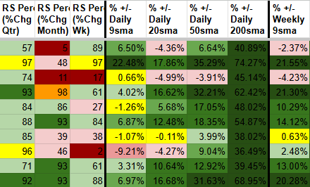
This pack combines three powerful tools into one seamless system. You get Watchlist Performance (RS Percentile, SMA relationships, % from moving averages, and historical context), Watchlist Relative Strength (strength ratio of how stocks compare to SPY, QQQ, their sector, and industry across multiple time frames), and Technical Add Ons (RSI, DSV, ATR volatility, ATR%, volume metrics, and more). Together they deliver real momentum and leadership insights — not just raw price action.
What You Get:
Comprehensive Watchlist Performance analysis with ATR family, SMA % relationships, volatility tracking, and historical setups
Relative Strength scoring including RS Rank, RS Percentile, daily change, and blended scores vs market and peers
Technical Add Ons tab with RSI, DSV, and supplementary metrics for deeper context
Master Score composite that blends everything into clear ranked recommendations
Clean conditional formatting, color-coded views, and fully sortable columns
One-click Refresh All + individual tab refresh buttons for daily updates
Ideas to Use It:
Quickly identify which stocks in your watchlist are showing true strength versus the market and sector
Spot hidden leaders that have strong relative strength even when short-term price action looks flat
Find laggards dragging down your portfolio so you can trim or replace them
Use the Master Score to prioritize new ideas and manage position sizing
Combine Performance and Relative Strength views for better swing trades and longer-term holds
Run daily refreshes to stay on top of momentum shifts across your entire list
What You Get:
Historical queries across daily, weekly, monthly, quarterly, and yearly moves
Clear win rates and success probabilities for each timeframe
Average returns, best-case, and worst-case outcomes
Gain/loss analysis for every matching historical setup
Weighted averages that prioritize larger sample sizes
Stock Performance Query
Quickly answer “What usually happens next?” using real historical data from similar setups.
This powerful tool lets you type any stock ticker and instantly see how similar technical setups performed in the past. It runs deep historical queries across multiple timeframes and conditions to deliver actionable insights.
The Stock Momentum Query Tool analyzes over 25 different historical query metrics across five specialized query sheets.
Each query calculates the probability of the stock closing higher (green) over the next day, week, month, and quarter — along with average % gain/loss, overall average return, Maximum Favorable Excursion (MFE), and Maximum Adverse Excursion (MAE).
These results are then combined and weighted by sample size to produce a clear, data-backed probability score for each timeframe.
Example: If the query shows an 80% chance of closing green next week based on 40 similar historical setups, that’s a strong, high-probability signal you can use to make more confident trading decisions.
What am I looking at?
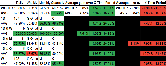
The left column shows the specific metric being queried.
For this example, AAPL had a 1.04% 1-day gain, and the tool found 199 similar historical instances.
Of those 199 days:
It closed green the next day 51% of the time
Next week 60%
One month later 67%
One quarter later 72%
When green, the average return was +8.09% (1 month) and +8.57% (1 quarter). Average Maximum Favorable Excursion (MFE) was +16.10% and Maximum Adverse Excursion (MAE) was -6.93% over the quarter.
The top row shows simple averages and weighted averages (which give more importance to queries with larger sample sizes).
This data gives you clear, quantitative risk/reward levels. For example, knowing AAPL’s average MAE is around -8% over the next quarter helps you set smart stop-loss points and assess whether the trade offers a favorable edge.
Frequent Days
After running all 25+ queries, certain dates appear more frequently than others across the different metrics.
This section highlights the most common historical dates that matched your current setup. The table shows:
How many times each date appeared across all queries (higher count = more significant)
The average performance when the stock hit those frequently matching dates (win rates, average returns, MFE, and MAE for the next week, month, and quarter)
It essentially gives you an “average of the averages” — a powerful summary of what happened on the dates that most closely resembled the current setup.
This helps you see the strongest recurring patterns and provides an extra layer of confirmation for your trading decision.
On the left is AAPL’s recent price history, highlighting the specific 1-day move being analyzed (+1.04% on 4/20).
This is the metric the queries use as their starting point. The tool scans the stock’s entire history and finds every past instance where AAPL had a very similar 1-day percentage change — along with matching patterns across other key timeframes (5D, 10D, 20D, weekly, monthly, etc.).
Visual Comparison
Below is AAPL’s daily chart from the day the query was run (top), along with charts of AAPL on the dates that appeared most frequently across all the queries.
This side-by-side view lets you visually compare the current setup with the most common historical matches.
Bottom Line:
The Stock Performance Query turns historical data into a clear statistical edge. Instead of guessing whether a setup is good, you can instantly see how the stock has performed in nearly identical situations in the past — complete with win rates, average returns, and realistic risk levels (MAE).
It’s one of the most powerful ways to validate trade ideas and increase your confidence before putting capital at risk.
Use it alongside the Watchlist Summary to make smarter, data-backed trading decisions.
The Stock Deep Dive Analyzer turns any single ticker into a complete, pre-built professional research workstation with 100+ interconnected sheets so you can instantly analyze every angle of a stock without starting from scratch.
It begins with entering the symbol and most recent Gap Date or Date of Interest,
Once the symbol is entered, the sheet instantly updates across multiple sections. The first major update is a comprehensive Quarterly and TTM year-over-year growth matrix covering key variables such as Cost of Revenue, Gross Income, Net Income, ROIC, and many others. Everything is color-coded so you can immediately see whether fundamentals are improving or deteriorating — and by exactly how much.
Stock Deep Dive
What You Get
Comprehensive scoring overview pulled from your Watchlist Summary (Total Score, Fundamentals, Growth, Technicals, Relative Strength) plus sector/industry context and current Industry Strength Ranking.
Quarterly and TTM year-over-year growth matrices with color-coded performance so you instantly see whether fundamentals are improving or deteriorating — and by how much.
Earnings reaction tracker: Enter past earnings dates once and see exact post-earnings price performance (Gap Day +1 through +80) with beat/miss percentages and average, max, and min results.
Quick peer comparison table — enter up to 4 closest competitors and automatically populated valuation, profitability, and ownership metrics.
Full fundamental matrix (last 20 quarters + TTM) with color-coded streaks, industry averages, and built-in charts for Cash from Operations, ROIC, EPS, FCF%, and more.
Once the earnings dates are entered, the price reaction column auto-fills for additional insight. You can instantly see how the stock price responded to each release — positive or negative surprises — with % surprise values entered manually by you.
Another powerful section is the quick peer comparison. Enter the symbols of the stock’s four closest peers and the table auto-fills with key valuation, profitability, and ownership metrics. You can instantly see how your stock stacks up against the competition.
Whether you’re confirming a buy, stress-testing a position, or building a full investment thesis, the Deep Dive turns hours of manual work into minutes of high-level insight.
which gives you the stocks Watchlist Summary score, and average Industry Score, along with a Relative Strength Box and current Industry Strength Ranking scores.
Once the symbol is entered, add the previous earnings dates in the designated section.
When those dates are populated, the earnings reaction tracker auto-fills with post-earnings performance: top row shows % of green days, followed by Gap Day +1 through +80 price moves, with Average, Maximum, and Minimum results at the bottom.
At the bottom of the sheet you’ll find a comprehensive fundamental matrix covering the last 5 years (both quarterly and TTM). It’s color-coded to highlight streaks of improvement, with dark green marking the maximum value in each column and industry averages shown in the top row.